
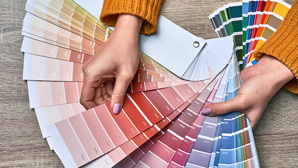
Talk to any branding expert, and they’ll tell you the significance of color in influencing your market. Unfortunately, many dentists aren’t aware that the success of their dental marketing campaign relies heavily on the ideal color scheme.
Why Is Dental Branding So Important?
For most dental owners, branding refers to tangible items such as logos, websites, and promotional items. While that’s true, dental branding is much more than that. In fact, it’s the most important element your dental practice possesses.
Your brand is the feeling people get when they interact with any part of your business. It combines the vision of leadership, the culture of the staff, and the excitement of the patients. It creates the expectation of what to expect if they do business with you.
Branding isn’t just about new patients; it’s essential for recruitment. No one goes on a blind date anymore. They will check out your website and see what you’re all about. “What you’re all about” is YOUR BRAND.
Let’s explore a guide to colors that will make your dental branding a hit.
The Importance of Color in your Dental Logo
Color psychology examines the interaction between colors and human behavior. If you think about it, color affects our everyday choices.
According to an article by the University of Southern California, several factors determine how people perceive color. For instance, even though both women and men like blue, the latter have an ardent inclination to this color.
Nationality can also affect how people view a color. For example, North Americans perceive yellow as a color that promotes optimism. This view could be different from people from other regions or continents.
Color psychology matters in marketing. Selecting the right colors for your branding and marketing campaigns can be the difference in gaining an edge over other practices in your area. It will influence how consumers perceive your brand and react to your marketing efforts.
Here’s a general list of color meanings as denoted in color psychology.
- Red– excitement, energy, and passion
- Orange– adventure, success, creativity
- Yellow– happiness, summer, positivity
- Pink– femininity, immaturity
- Green– nature, health, growth
- Blue– harmony, trust
- White- innocence, cleanliness
- Black- Mystery, sophistication
We wrote this article for dental practices because consumer behavior is different for different industries. Where red might be great for a college football team, it might not send the best message for a dental practice.
Best Colors for Dental Marketing
Blue
 Blue skies ahead!
Pros:
- This color is a crowd-pleaser. It evokes feelings of tranquility.
- Some research shows you can lower blood pressure by simply looking at blue walls. Having a color that reduces anxiety could make all the difference.
- It is a safe choice as most people see it as traditional and non-threatening.
Cons:
- It is an overused color, especially in dentistry. If you’re trying to stand out, look into shades that combine some gray, like Florentine Blue.
- Because it can feel tranquil, that can also lend itself to feelings of sadness or aloofness. I wouldn’t let this scare you from using it but don’t overdo it; blue logo, website, walls, scrubs, etc. You get my point.
Green
 Who doesn’t love a nature-themed office!
Pros:
- Green is perfect for your dental practice as it evokes feelings of renewal, cleanliness, and relaxation.
- It is easy to incorporate because you can utilize plants and other natural sources.
- Using certain shades, such as mint, can evoke a feeling of freshness.
Cons:
- Like blue, it is overused.
- Green can trigger thoughts of money that can come across as advantageous or greedy for some people.
Yellow
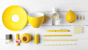 Is it a bright sunshiny day?
Pros:
- It’s bright and evokes warmth.
- It is said by many to be the most recognizable color.
Cons:
- Use wisely. Painting your treatment room yellow may conjure up images of yellow teeth.
- Using too much yellow can invoke feelings of frustration.
- Yellow can be difficult to read.
Purple
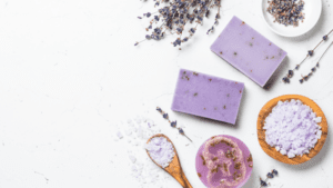 Purple is a polarizing color. Most people either love it or hate it, so don’t shy away from it but think about how you will use it.
Pros:
- Darker shades are more mature and can be ideal for adults.
- Some people view purple as luxurious. Great for a cosmetic practice.
- People view purple as altruistic.
Cons:
- The overuse of purple can come across as arrogant.
- As a divisive color, it’s not the safe choice, but if your target demographic is older wealthy adults, it would be a great option.
Gray
 Neutral as it gets.
Pros:
- Gray is interesting because it doesn’t necessarily evoke a particular emotion. That makes it a great choice as an accent to a bolder color.
- It promotes calmness which makes it a great office color.
Cons:
- Gray is a mature color. You might not want to use this hue as your primary color in a pediatric practice.
- Using dark gray can evoke a feeling of sadness. (Think gray skies.)
Colors To Choose Wisely
Black
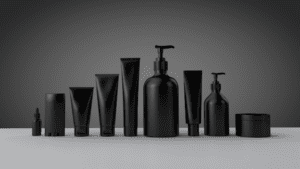 Is it too much!?
Pros:
- This color represents luxury and wealth. Great for a high-end cosmetic practice.
- As a serious color, it represents the boldness wealthy people will respond to.
Cons:
- Black is frequently represented with people in mourning.
- In nature, we sometimes represent black with decay.
Yellow
 Is it a bright sunshiny day?
Pros:
- It’s bright and evokes warmth.
- It grabs attention.
Cons:
- Use wisely. Painting your treatment room yellow may conjure up images of yellow teeth.
- Using too much yellow can invoke feelings of frustration.
- Yellow can be difficult to read.
Orange
 Probably not in your color wheel!
Pros:
- Many sports teams use orange because it is energetic and enthusiastic. In the right type of practice, this could be a benefit.
- It will stand out in your marketing.
- It’s considered playful.
Cons:
- Since it is a high-energy color, it could also stimulate people when you need them to be relaxed.
- Orange is best used as an accent color. Usually with white, black, or blue.
Red
 Stop!
Stop!
Pros:
- Red is bold and attention-grabbing.
- In medical, Red is used for emergencies. It is perfect for that type of practice.
Cons:
- Red can be a sign of warning or danger. Think about a stop sign or “In the red” in the finance world.
- Avoid using it in your offices as it may remind patients of blood.
- Red is sometimes associated with anger.
Brown
 Want an earthy vibe?
Pros:
- When done right, it evokes relaxation and sometimes intimacy.
- Because it is viewed as a natural color, it evokes warmth, comfort, and security.
- Lighter versions (think Taupe) can be great for offices for their feelings of warmth and ability to match well with various colors.
Cons:
- Brown is dependent on the tone. If it’s dark, the feelings of mud (or other not-so-great things found in nature) aren’t very appealing.
- In surveys, Brown tends to be people’s least favorite color.
Additional notes on color:
- Pink is compassionate and nurturing but also feminine and childish. I would avoid it unless you have a pediatric practice for girls.
- Men are more likely to be drawn to blues.
- Women are more likely to be drawn to greens.
- Blue is the least threatening color, and green is the most relaxing.
- White evokes a sense of youth.
- Purple is the color preferred by seniors.
- Silver is often linked to technology.
- Bright, vibrant colors can be hard to read.
- When combining colors, don’t choose colors that are far away from each other on the color wheel.
Colors help create a positive identity for your dental practice. Beyond creating a feeling for your brand, your goal is to generate interest in your practice. Ultimately, selecting the right colors will impact potential patients’ decisions. Whether you are looking for the perfect logo design, sending out direct mail, or renovating your dental office.
It’s important to remember that color is not universal. No matter what you choose, some people will like it and some won’t. Thats’ ok. Be honest with the color that will appeal to the people you want to serve most, and make sure you like it too. You’re the one that has to live with it every day.
Discover more articles on Leadership, Branding, and Team Development!